Bellingham, South London
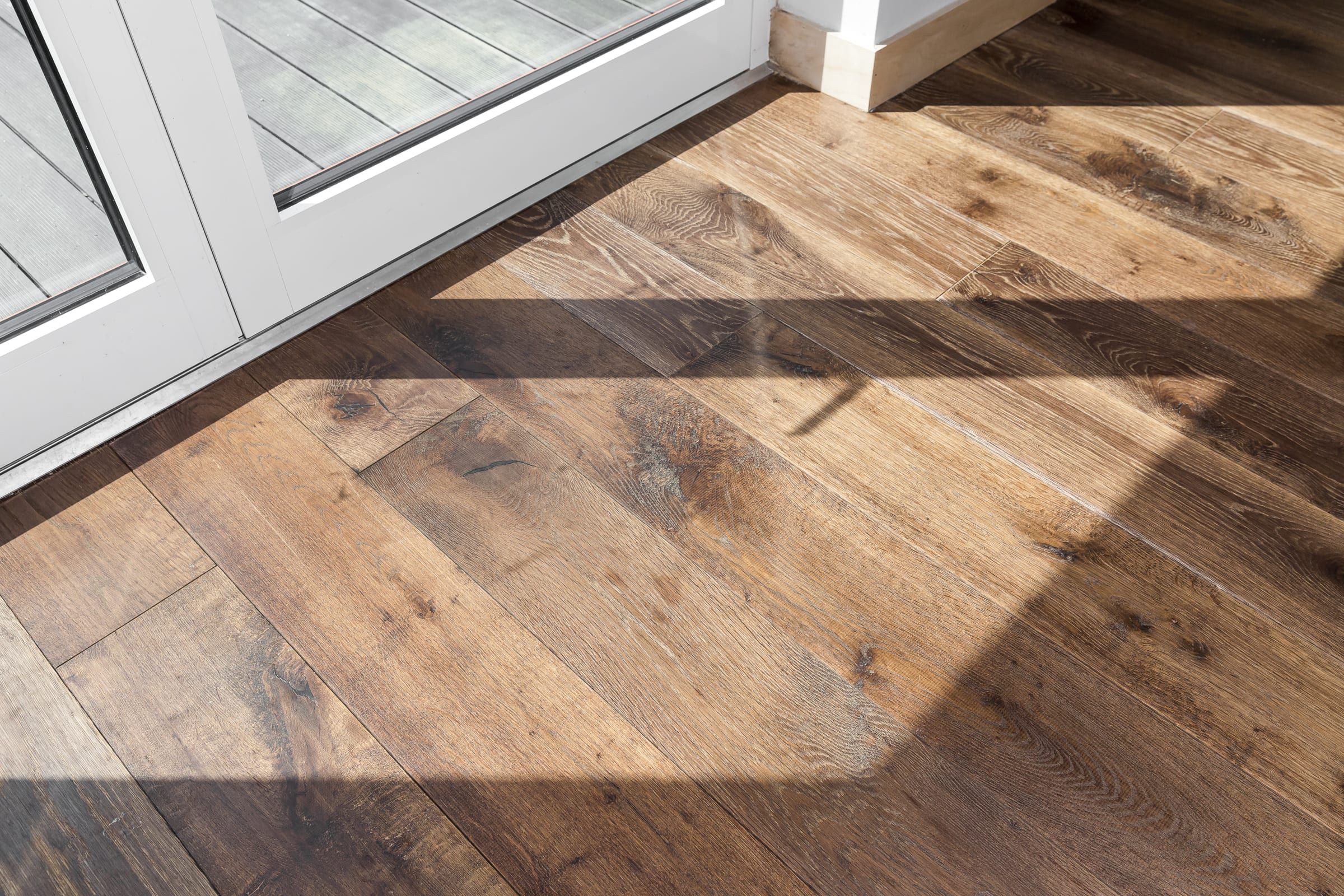
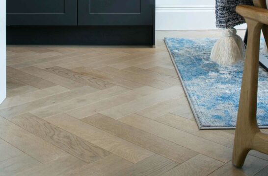
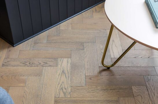
A Bellingham house is completely transformed and creates modern open plan living with Urban Nature Tannery Brown wood floors
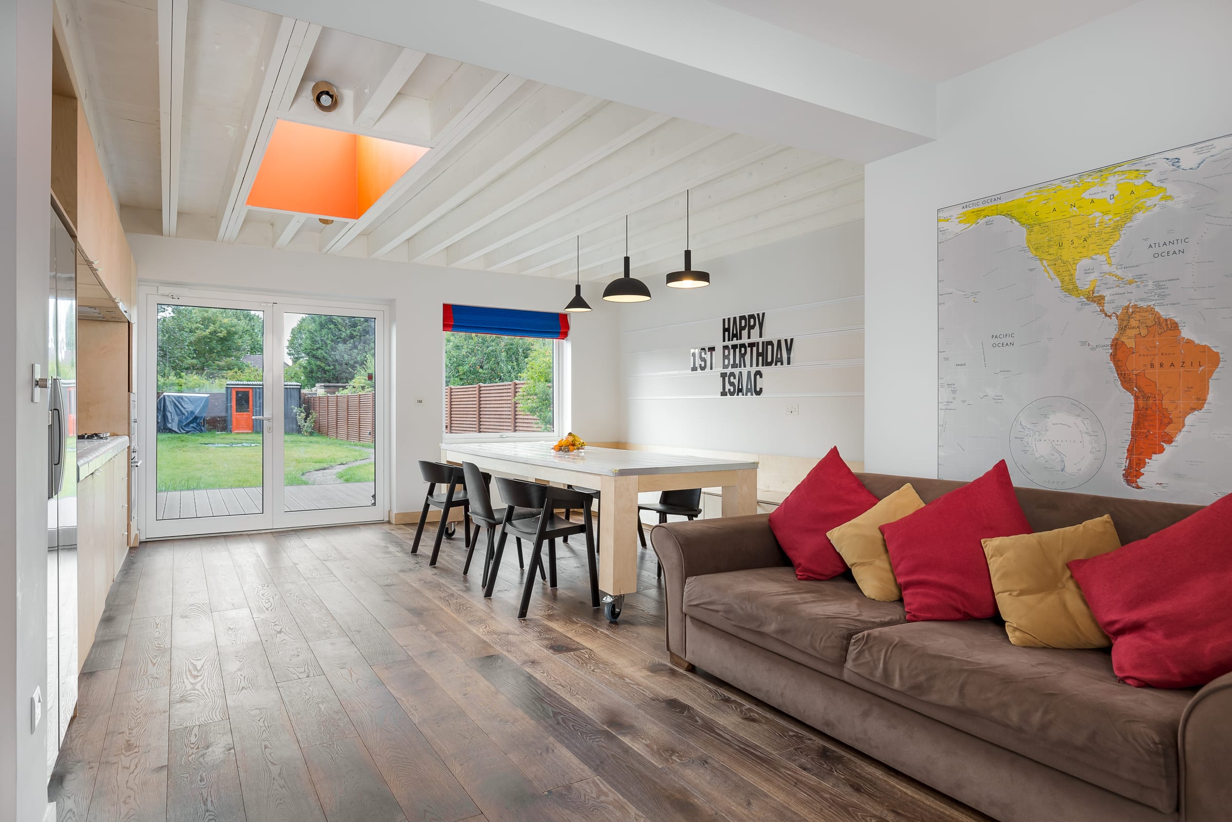
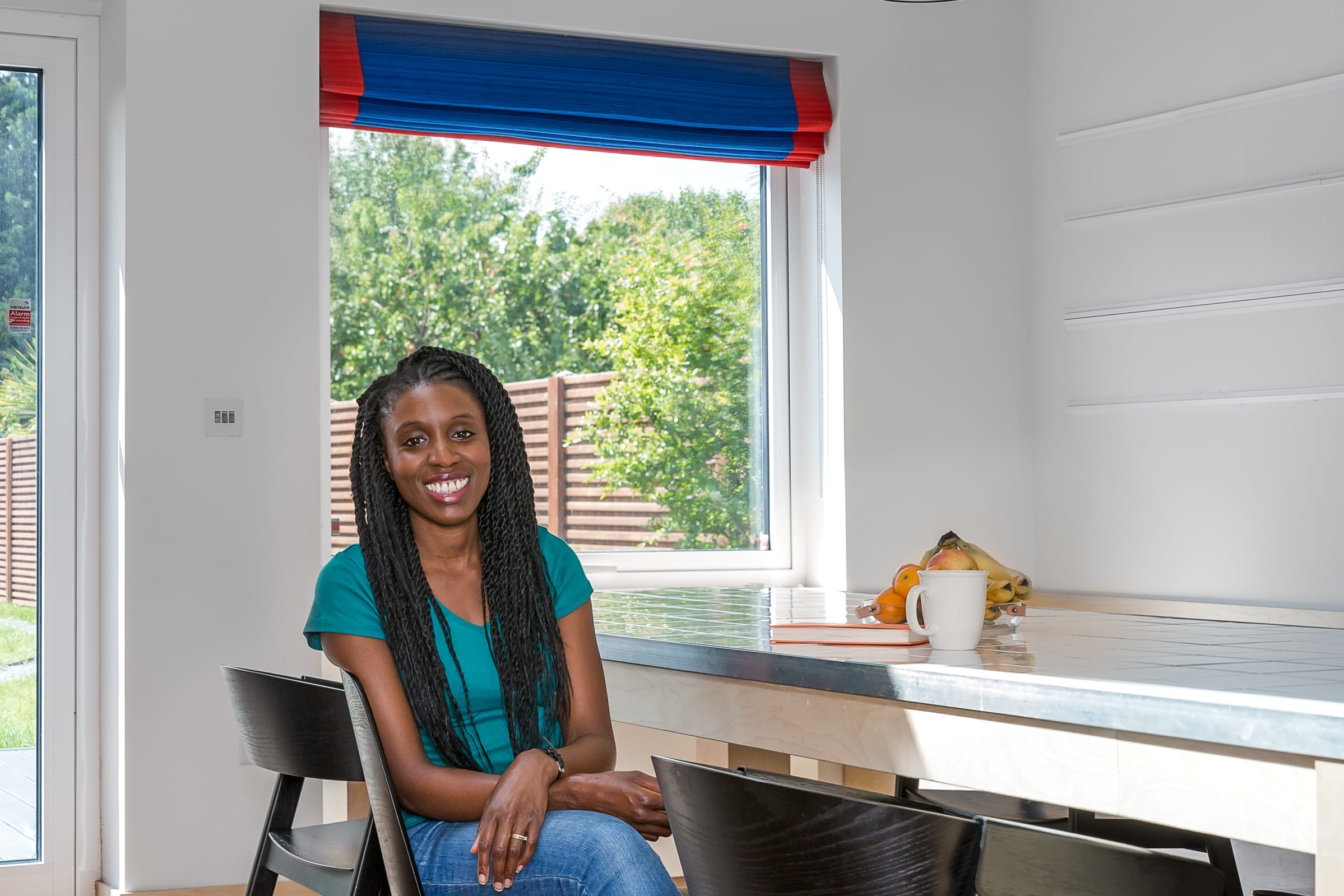
Modern, bright and spacious open plan living has been created in this family home in Bellingham, South London which belongs to Amifa Kamara and her husband. The home featured on Channel 4’s Ugly House to Lovely House series with George Clarke. When they bought the house the couple were expanding their young family and were looking for a new home they could grow into. Amifa explains, We were already living in this area and were keen to stay here so that narrowed down our search, but buying in London was expensive so we were on the lookout for something affordable, even if that meant it needed a lot of work.
“When we looked at this house we certainly can’t say we fell in love with it, but we loved the potential it offered. It was an ex-council house and was built when room sizes were very generous so while it needed a complete overhaul it was great value for money and in the exact area we wanted to be."
“When we viewed it we could see that the kitchen was in a very dubious extension tacked on to the back of the house. Even with my untrained eye I could see the walls and ceiling did not meet in a straight line. The DIY extension was 3m deep, so a decent size, but a survey confirmed the house was unmortgageable unless the kitchen was ripped out and moved back to the original – and safer – part of the house.” The previous owners realised the sale would not go through if the kitchen stayed in the makeshift extension, so weeks passed as Amifa and her husband anxiously waited for the kitchen to be reinstated in the original part of the house, then for the bank to finally confirm that they would indeed value the house at more than zero and the purchase could proceed.
“We moved in during October 2017 and started to get a feel for the house and how we lived in it so we could start planning the renovation work to make sure we created a configuration that worked for us. It was quite odd that upstairs there was a bathroom with a tub and sink, but the only loo was downstairs, so one thing we did do was create a new shower room upstairs which included a toilet. I was pregnant at the time so traipsing downstairs during the night was not ideal. We also changed the dilapidated windows to double glazed which desperately needed doing. We had just started liaising with a local architect to start planning a new extension on the ground floor when my mum called me one evening and told me to tune into Channel 4 and watch a programme called Ugly House to Lovely House. I wasn’t at all insulted she thought our house could feature, it really was an ugly house but we knew that when we bought it – it was all about our vision to transform it from that state. At the end of the show they gave contact details for how to get involved and I remember thinking I’d be very surprised if they turned down our house – it was that ugly!”
“After producers visited it was selected to feature on the programme and we were assigned Carl Turner Architects and an interior designer who would work with us to create our lovely house. We had several planning meetings so they could understand our brief, vision and design aspirations. They came up with an alternative layout and design features which we loved. We originally planned to put the utility room in the new extension near the kitchen, but the architects had a better plan. They suggested making better use of one of the dead spaces at the front of the house – a storage room, which must have at some point housed a water tank. This design created a more seamless open plan room, with a mini L-shape, meaning we have a super-sized dining table and more chill-out space with benches that double-up as storage.
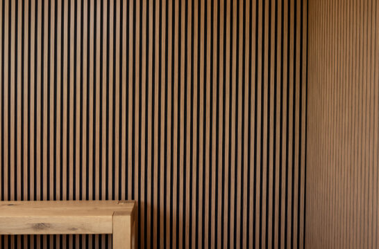
“The approved extension was going to add a huge 5.4m length to the downstairs space. With George’s involvement the design was built around long clean lines and natural light – so from the study and front windows you could look straight through the homes living space, kitchen and out to the garden. They also came up with the design feature to keep the ceiling exposed in the new extension area. To enhance this as a feature they actually doubled up the thickness of the beams to create a more impressive finish and a large skylight adds even more natural light to this area. My overall design vision was to somehow combine timeless design with more fun elements to reflect our personalities. Timelessness would be brought in by the use of natural materials like wood. The fun elements would be injected with pops of colour and some unusual touches.. As they got to know my personality they began to suggest ideas that I really liked, for example the lettering on the wall which I play around with regularly, my husband never knows what to expect when he comes home. They also introduced us to the concept of the simple plywood finishes used throughout and we really loved the idea, both aesthetically and for budget purposes.
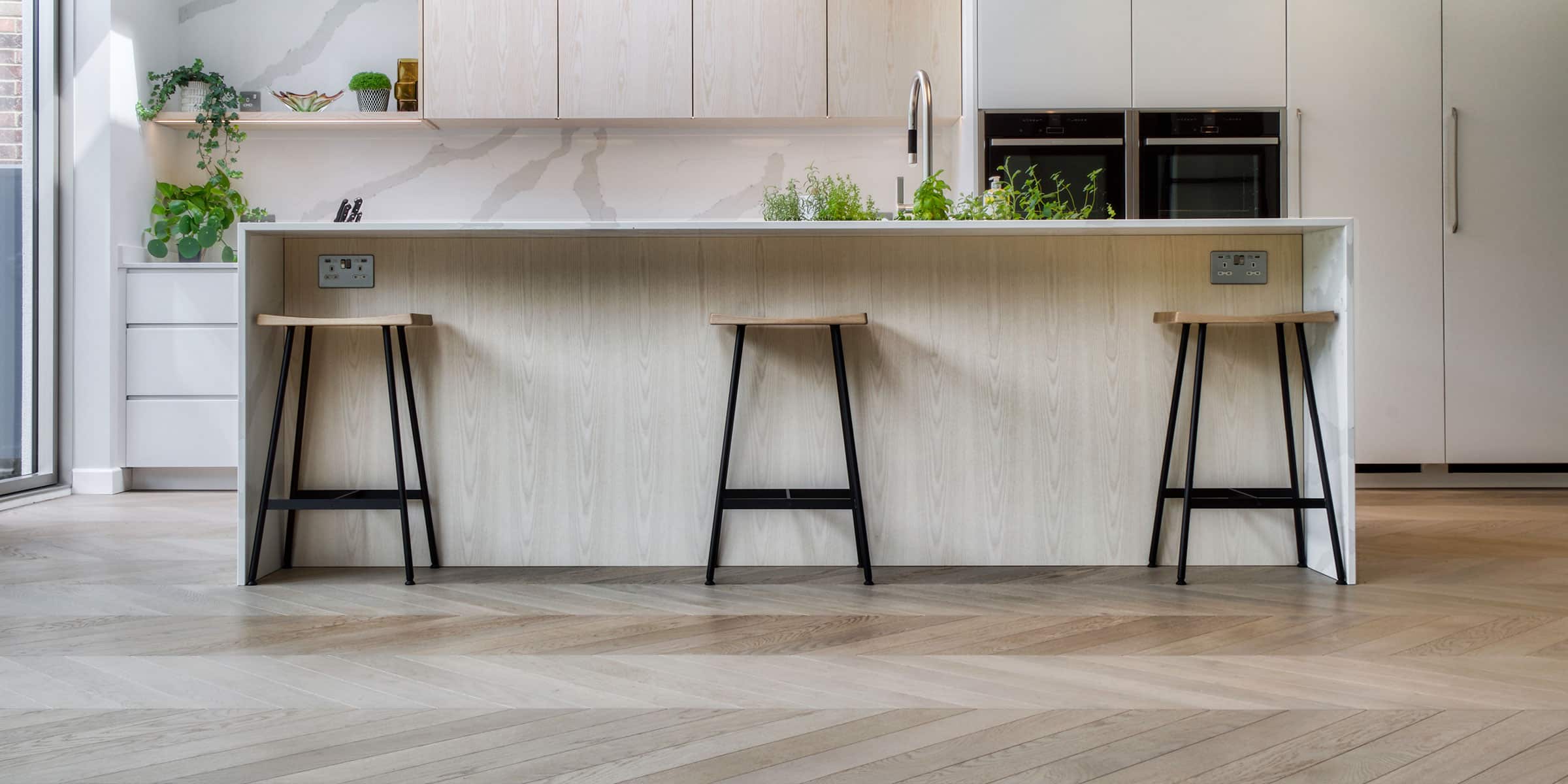
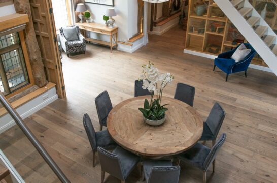
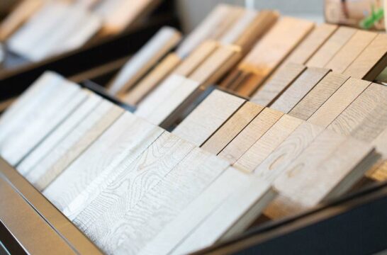
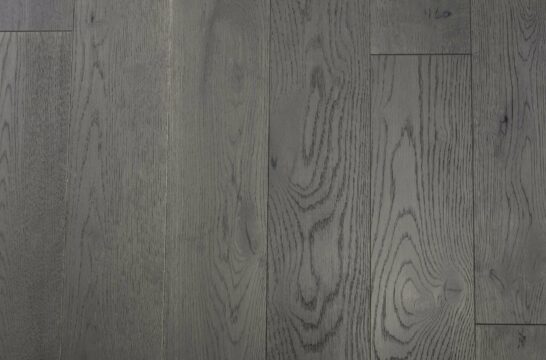
Originally I wanted an island but they convinced us to have this bespoke table made. It matches the ply and has the same tiling and grout as the kitchen worktop and splashback. I adore the blue grout because it adds fun and colour. Before taking part in the show I had no idea you could even get grout in such a wide range of colours. The castor wheels on the bottom of the dinning table make it multi-functional. I can pull it closer to the kitchen so it becomes an island and extra kitchen work surface space, we can pull it back to create entertainment space and for the kids to play, and we even wheel it into the garden when we entertain outside. It was an inspired idea which works so well with our lifestyle. When it came to flooring the shows designer suggested the couple take a look at the V4 collections. They looked great and there was so much to choose from. I didn’t want a classic oak colour, I didn’t think it would work with the ply, it would all be a bit similar in tone and end up looking bland. I did consider a grey but felt this might be a bit too modern and of the moment, so not right for the classic mix I wanted in the design.
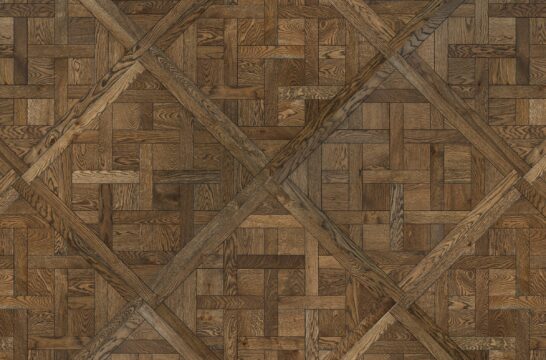
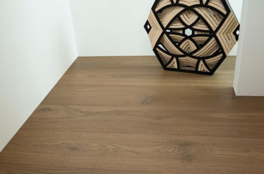
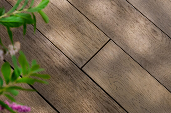
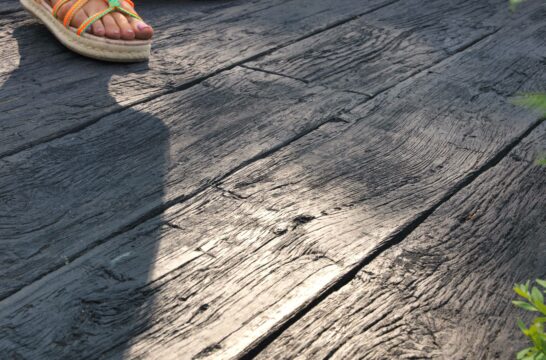
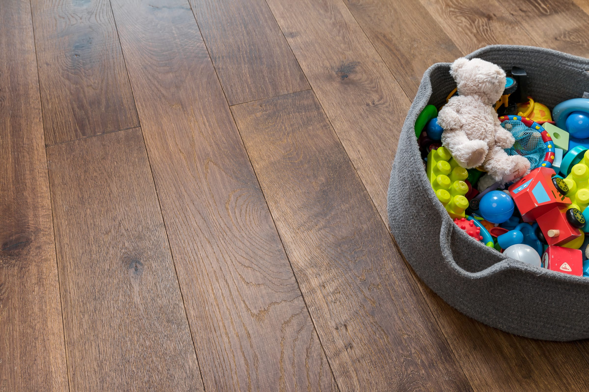
“We actually ended up having a ‘flooring’ meeting as we needed to make a decision. I had one more sample due to arrive, the Urban Nature Tannery Brown, but it didn’t arrive before our meeting. After a long debate we decided on a floor, however I said to the team it’s not a definite until this final sample arrives. Just as the meeting was wrapping up the sample got posted through our door. We opened it and everyone around the table immediately agreed it was the one – it was obviously meant to be.
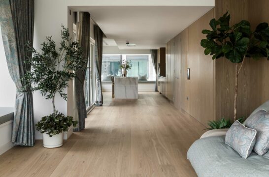
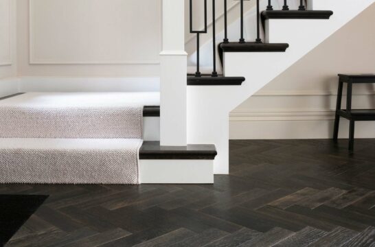
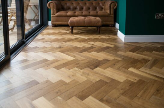
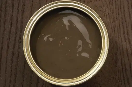
“I loved that the finish was darker than a typical classic oak floor, but not too dark. It looked perfect against the ply we were using adding a lovely contrast with its rustic oak grains and warmer tones. The floor felt classic, but also playful, so fitted our design bill perfectly.” The couple moved out during the main build phase which started in March 2018. It was a big project and it was almost ten months later that we moved back in, at the end of 2018. We absolutely love the finished home. It’s full of our own personality and the spaces work so well for how we live as a family. I absolutely love the wood floors and I am so glad we waited for that final sample to arrive. It adds a lovely tone and texture to the space, and the character is just enough to animate the large open plan room without being too dominating.
“With all the work completed I think we can live up to the programme’s title we were involved with and say we managed to turn our ugly house into a lovely house. We’re really grateful to have a house that works so well for us, and with baby number two walking now the gorgeous floor is truly appreciated by the whole family and is proving perfect for modern family life.”
